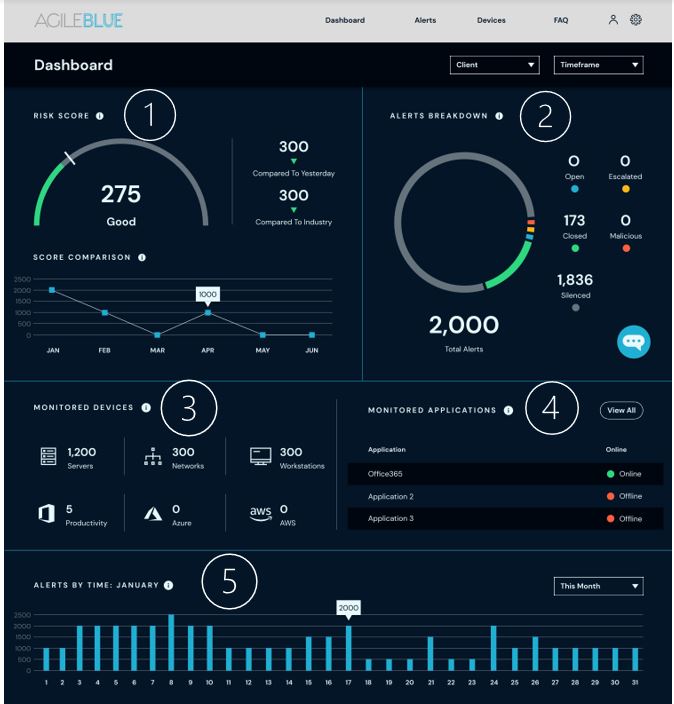
When it comes to logging into any SOC-as-a-Service (SOCaaS) portal most of us try to grab what info we need and spend as little time in the portal as possible. One of the benefits of having an automated threat analytics portal is that you shouldn’t need to invest a huge amount of time to review the data in the portal. Have you ever stopped to wonder what you are missing by doing this? Every SOCaaS provider has different dashboard, however there are several items that should always be included. Below you’ll find a quick reference guide on AgileBlue dashboard, what to look for and what it means to you.

- Risk Score – Organization’s credit score, only difference is you want the lower number here. Over a dozen algorithms are used to calculate specific to your network.
- Alerts breakdown – AgileBlue’s SOC is 24×7 so you don’t have to be, see what they’re up to at any time of the day.
- Monitored Devices – On prem, remote, or in the cloud…wherever the device is we can monitor it and here is where you track it.
- Monitored Applications – O365, SaaS, or custom applications…we have your data covered no matter where it sits.
- Alerts by time – Spikes in alerts, coincidence or actively being targeted? See day-over-day activity in a quick glance.

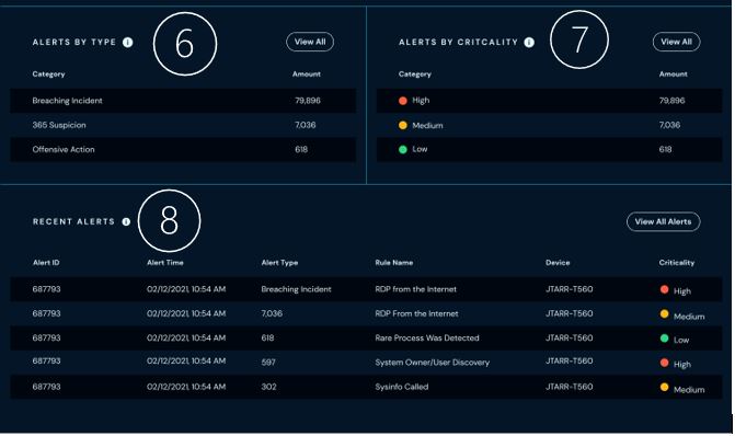
- Alerts by Type – Mapped to Mitre framework, see what threats actors are trying to do to get into your network.
- Alerts by Criticality – Threat actor or bad hygiene? Alert criticality can help determine where adjustments need to be made in policies or the network.
- Recent Alerts – Quick glance of your most recent alerts
Interested in a more detailed tour of the AgileBlue dashboard? Request a demo with us.


